
CSS How To
1 year ago
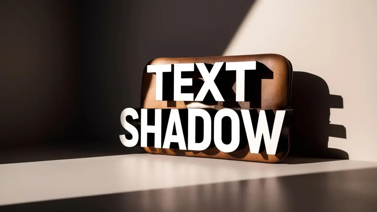
Photo Credit to CodeToFun
The text-shadow property in CSS is used to apply shadow effects to text. It allows you to add one or more shadows to text, making it stand out and giving it a three-dimensional effect.
This property can enhance the visual appeal of your text content and is widely used in web design for creating various text effects.
The syntax for the text-shadow property is straightforward. It allows you to define multiple shadows, each specified by an offset, a blur radius, and a color.
element {
  text-shadow: offset-x offset-y blur-radius color;
}The default value of the text-shadow property is none, meaning no shadow is applied to the text.
| Value | Description |
|---|---|
| offset-x | A length value (e.g., 2px, 0.5em) representing the horizontal offset of the shadow. |
| offset-y | A length value representing the vertical offset of the shadow. |
| blur-radius | A length value representing the blur radius of the shadow. It is optional and defaults to 0 (sharp shadow). |
| color | A color value (e.g., #000, rgba(0,0,0,0.5)) representing the color of the shadow. It is optional and defaults to the current color of the text. |
In this example, we'll apply a simple shadow effect to a heading.
<!DOCTYPE html>
<html lang="en">
<head>
  <meta charset="UTF-8">
  <meta name="viewport" content="width=device-width, initial-scale=1.0">
  <title>CSS text-shadow Example</title>
  <style>
    h1 {
      text-shadow: 2px 2px 5px rgba(0, 0, 0, 0.3);
    }
  </style>
</head>
<body>
  <h1>Text with Shadow</h1>
</body>
</html>The text-shadow property is supported in all modern browsers, including the latest versions of Chrome, Firefox, Safari, Edge, and Opera. It is also supported in most mobile browsers. However, it is always a good practice to test your website across different browsers to ensure compatibility.
The text-shadow property is a versatile tool for adding visual depth and interest to text on your web pages.
Whether you're looking to create subtle shadow effects or dramatic text styles, this property provides the flexibility you need. Experiment with different values to see how text-shadow can enhance your text and make your web designs more engaging.

For over eight years, I worked as a full-stack web developer. Now, I have chosen my profession as a full-time blogger at codetofun.com.
Buy me a coffee to make codetofun.com free for everyone.
Buy me a Coffee


If you have any doubts regarding this article (CSS text-shadow Property), please comment here. I will help you immediately.